Showing posts with label Android Design. Show all posts

Design Principles

Written By userstyles on Friday, June 15, 2012 | 12:45 AM

These design principles were developed by and for the Android User Experience Team to keep users' best interests in mind. Consider them as you apply your own creativity and design thinking. Deviate with purpose.

Enchant Me

Delight me in surprising ways

A beautiful surface, a carefully-placed animation, or a well-timed sound effect is a joy to experience. Subtle effects contribute to a feeling of effortlessness and a sense that a powerful force is at hand.

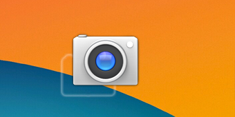
Real objects are more fun than buttons and menus

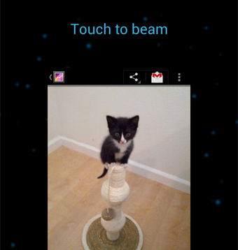
Allow people to directly touch and manipulate objects in your app. It reduces the cognitive effort needed to perform a task while making it more emotionally satisfying.

Let me make it mine

People love to add personal touches because it helps them feel at home and in control. Provide sensible, beautiful defaults, but also consider fun, optional customizations that don't hinder primary tasks.

Get to know me

Learn peoples' preferences over time. Rather than asking them to make the same choices over and over, place previous choices within easy reach.

Simplify My Life

Keep it brief

Use short phrases with simple words. People are likely to skip sentences if they're long.

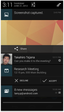
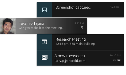
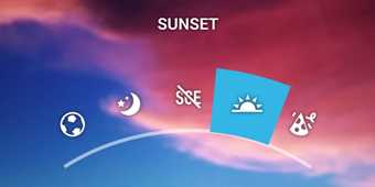
Pictures are faster than words

Consider using pictures to explain ideas. They get people's attention and can be much more efficient than words.

Decide for me but let me have the final say

Take your best guess and act rather than asking first. Too many choices and decisions make people unhappy. Just in case you get it wrong, allow for 'undo'.

Only show what I need when I need it

People get overwhelmed when they see too much at once. Break tasks and information into small, digestible chunks. Hide options that aren't essential at the moment, and teach people as they go.

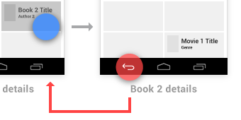
I should always know where I am

Give people confidence that they know their way around. Make places in your app look distinct and use transitions to show relationships among screens. Provide feedback on tasks in progress.
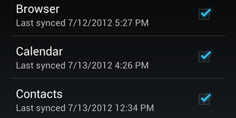
Never lose my stuff

Save what people took time to create and let them access it from anywhere. Remember settings, personal touches, and creations across phones, tablets, and computers. It makes upgrading the easiest thing in the world.

If it looks the same, it should act the same

Help people discern functional differences by making them visually distinct rather than subtle. Avoid modes, which are places that look similar but act differently on the same input.

Only interrupt me if it's important

Like a good personal assistant, shield people from unimportant minutiae. People want to stay focused, and unless it's critical and time-sensitive, an interruption can be taxing and frustrating.

Make Me Amazing

Give me tricks that work everywhere

People feel great when they figure things out for themselves. Make your app easier to learn by leveraging visual patterns and muscle memory from other Android apps. For example, the swipe gesture may be a good navigational shortcut.

It's not my fault

Be gentle in how you prompt people to make corrections. They want to feel smart when they use your app. If something goes wrong, give clear recovery instructions but spare them the technical details. If you can fix it behind the scenes, even better.

Sprinkle encouragement

Break complex tasks into smaller steps that can be easily accomplished. Give feedback on actions, even if it's just a subtle glow.

Do the heavy lifting for me

Make novices feel like experts by enabling them to do things they never thought they could. For example, shortcuts that combine multiple photo effects can make amateur photographs look amazing in only a few steps.

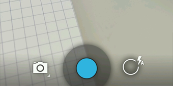
Make important things fast

Not all actions are equal. Decide what's most important in your app and make it easy to find and fast to use, like the shutter button in a camera, or the pause button in a music player.

Android's system UI provides the framework on top of which you build your app. Important aspects include the Home screen experience, global device nav

Android's system UI provides the framework on top of which you build your app. Important aspects include the Home screen experience, global device navigation, and notifications.

Your app will play an important part in keeping the overall Android experience consistent and enjoyable to use. At the end of this chapter we introduce the main elements for achieving this goal in your app.

Read on for a quick overview of the most important aspects of the Android user interface.

Home, All Apps, and Recents

Home screen

Home is a customizable space that houses app shortcuts, folders and widgets. Navigate between different home screen panels by swiping left and right.

The Favorites Tray at the bottom always keeps your most important shortcuts and folders in view regardless of which panel is currently showing.

Access the entire collection of apps and widgets by touching the All Apps button at the center of the Favorites Tray.

All apps screen

The All Apps screen lets you browse the entire set of apps and widgets that are installed on your device.

Users can drag an app or widget icon from the All Apps screen and place it in any empty location on any Home screen.

Recents screen

Recents provides an efficient way of switching between recently used applications. It provides a clear navigation path between multiple ongoing tasks.

The Recents button at the right side of the navigation bar displays the apps that the user has interacted with most recently. They are organized in reverse chronological order with the most recently used app at the bottom.

Switch to an app by touching it. Remove an item by swiping left or right.

System Bars

The system bars are screen areas dedicated to the display of notifications, communication of device status, and device navigation. Typically the system bars are displayed concurrently with your app. Apps that display immersive content, such as movies or images, can temporarily hide the system bars to allow the user to enjoy full screen content without distraction.

  1. Status Bar

    Displays pending notifications on the left and status, such as time, battery level, or signal strength, on the right. Swipe down from the status bar to show notification details.

  2. Navigation Bar

    New for phones in Android 4.0, the navigation bar is present only on devices that don't have the traditional hardware keys. It houses the device navigation controls Back, Home, and Recents, and also displays a menu for apps written for Android 2.3 or earlier.

  3. Combined Bar

    On tablet form factors the status and navigation bars are combined into a single bar at the bottom of the screen.

Notifications

Notifications are brief messages that users can access at any time from the status bar. They provide updates, reminders, or information that's important, but not critical enough to warrant interrupting the user. Open the notifications drawer by swiping down on the status bar. Touching a notification opens the associated app. More on Notifications

Most notifications have a one-line title and a one-line message. The recommended layout for a notification includes two lines. If necessary, you can add a third line. Timestamps are optional.

Swiping a notification right or left removes it from the notification drawer.

Common App UI

A typical Android app consists of action bars and the app content area.

  1. Main Action Bar

    The command and control center for your app. The main action bar includes elements for navigating your app's hierarchy and views, and also surfaces the most important actions.

    More on the Action Bar

  2. View Control

    Allows users to switch between the different views that your app provides. Views typically consist of different arrangements of your data or different functional aspects of your app.

  3. Content Area

    The space where the content of your app is displayed.

  4. Split Action Bar

    Split action bars provide a way to distribute actions across additional bars located below the main action bar or at the bottom of the screen. In this example, a split action bar moves important actions that won't fit in the main bar to the bottom.

New Guides for App Designers!

New Guides for App Designers!

The Android UX team has put together a set of guidelines for the interaction and visual design of Android applications. The new collection provides an overview of Android styles, design patterns, building blocks for exceptional Android designs, and more.

Android Design

Over time, the documents below will be deprecated as more design information is published at the new location.

Ice Cream Sandwich (Android 4.0) marks a major milestone for Android design. We touched nearly every pixel of the system as we expanded the new design approaches introduced in Honeycomb tablets to all types of mobile devices. Starting with the most basic elements, we introduced a new font, Roboto, designed for high-resolution displays. Other big changes include framework-level action bars on phones and support for new phones without physical buttons.

We focused the design work with three overarching goals for our core apps and the system at large. As you design apps to work with Android, consider these goals: